[Update] Overview Update - The New, Better and Familiar
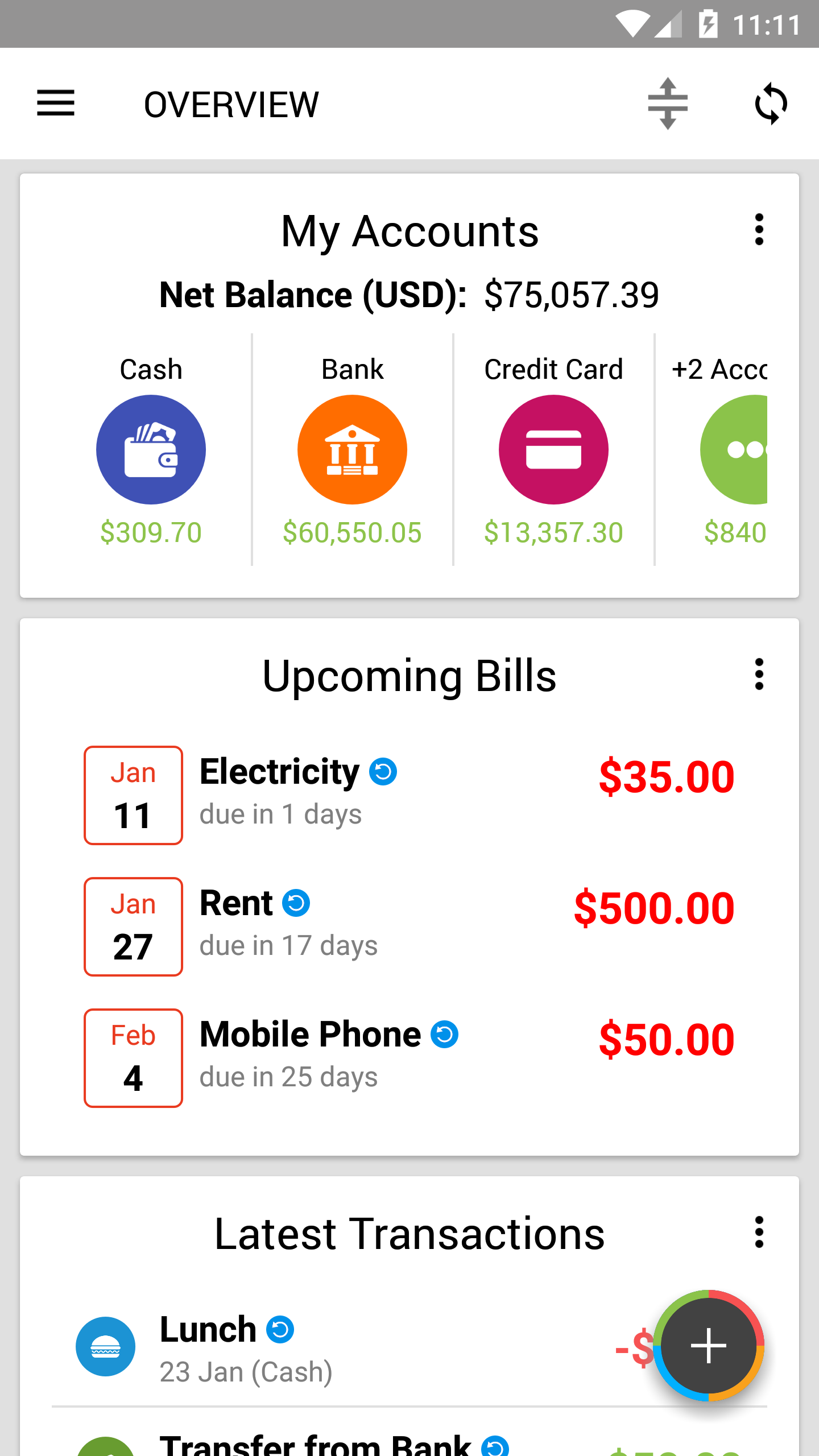
If you have updated to the latest version of Expense IQ, you may have noticed that the Overview screen looks even more pleasing and welcoming!
In accordance with the goal to simplify expense management and encourage good financial and budgeting habits, our goal has always been the same - to provide powerful features with ease of use like no other.
So what exactly has been improved?
The New
All cards re-designed - cleaner and better visibility!
- Re-designed to provide ease of use and better readability
- Re-arranged information to prioritize the important stuff
- Generally larger text
- Information flow - smoother and easier for new users to jump right in
New card #1 - Latest Transactions
Your most recent transactions at a glance! Simply tap to edit if you accidentally added something wrongly, or use it to check if you have entered your latest meal yet!
New card #2 - Upcoming Bills
Nobody likes paying bills late, so we added a nice list of upcoming bills so you can check them right from the Overview and never miss another deadline again!
New alternate layout - Compact mode for accounts
"We heard you like overviews, so we overview-ed the account overview so you can overview more while you overview."
Bad memes aside, we added a grid/compact mode for the Accounts card that shows more compact information while taking up less vertical space.
If you have many accounts, simply swipe the accounts left/right to scroll through your accounts.
To toggle between the List mode (Classic style) and Compact mode, simply tap on the 3 dots on the My Accounts card and switch modes.
Try it!
The Better
More intuitive Overview Customization screen
Better icons and indicators to make it more intuitive for new users yet keeping it familiar to current users.
A new menu button for every card
You will find the new 3-dots menu button on the cards with relevant options:
- Hide - hides the card from the Overview. You can turn it back on by tapping the Reorder/customize button at the top-right of the Overview, and toggling from the Overview Customization screen
- Reorder - takes you to the reorder screen (aka Overview Customization) to reorder the cards as you like
- Settings (available for the 2 charts) - customize the card if customization settings are available. For example, you can change to the time period you prefer it to show for the charts.
- Switch between Compact and List modes (available for My Accounts)
... and more! This change also allow us to add more customization options to each card in future easily! Hurrah!
Try them out!
The Familiar
For those who have been with us, you will find that everything from the old design is brought over to the new design, except better (especially for your eyes)!
As a bonus, new icons for Accounts and Categories. ;)
Go get the update!
RELATED


