

New Simplified Design For Quick Entry of Expenses and Bills
The screen we interact with the most on a day-to-day basis is no doubt the New Entry screens (eg Add Expense/Income).
We want to improve your experience and shave precious seconds off adding transactions, so you can continue doing the important stuff while still keeping on top of your expenses.
The main driving forces behind the improvement design - ease of use, intuitive, consistency and responsiveness.
Enough of the chatter - read on for some screenshots!
The New stuff
Main design goals: faster, easier, smoother experiences
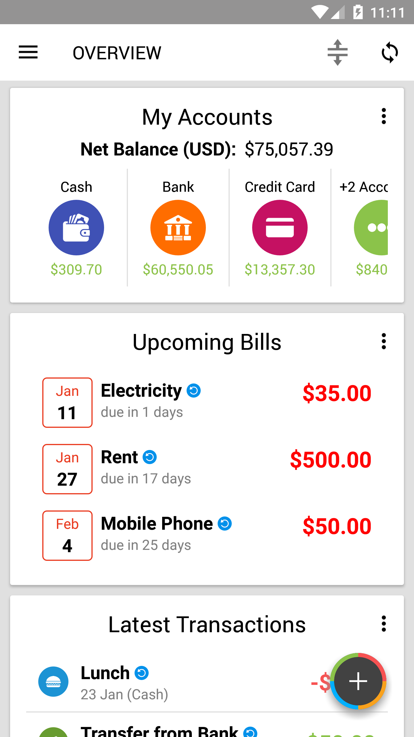
For the past few months, we have been working to improve your expense tracking needs. We added a convenient Add Favorite Transactions card, re-designed the Overview and added a Repeating Items screen!
This time, a whole bundle of screens for adding transactions got a major facelift, making them easier to use than ever!
Ease of use + Intuitive
In the new design, our goals include a modern design while keeping it familiar for our long-timers.
For current users, you should be up to speed in no time (and faster than before)! For new users, our main goal is to lower the learning curve even more and provide a smooth and pleasing experience as much as we can!
Smoothing the rough edges
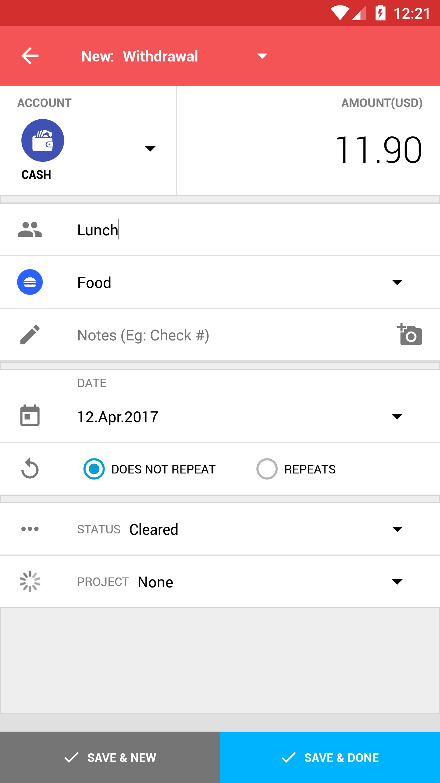
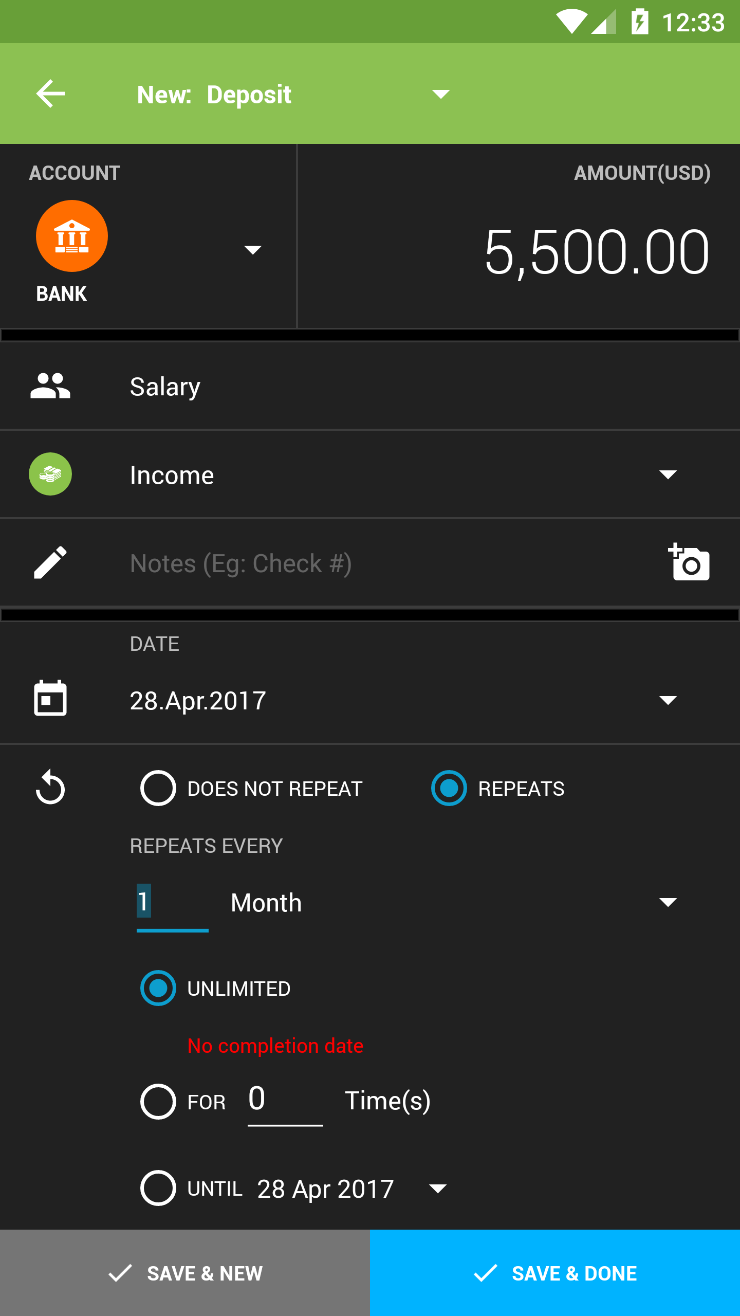
- "Amount" is now bigger and much easier to read
- Items now flow naturally from top to bottom, most commonly used on top
- Visual grouping of related fields
- Prominent color on header action bar to tell what type of transaction you are adding at a glance
What do these mean for you?
It is now even easier to review transactions and check all details at a glance. Also, the new design makes it far easier to introduce to those you care about to start managing their finances if they have yet to do so!
Responsive design - works great on any screen size
One advantage of the new design: it looks equally great on larger screens such as tablets (if we say so ourselves)!


New smart feature - Adaptive Entry Style (Beta)
Adaptive Entry Style is a new beta feature we are testing as some of you have expressed that you prefer to enter the amount first (as numbers are easy to forget), but there are also a significant number of you who prefer to enter payee/item first.
It's a simple system that picks up your latest behavior and you can switch modes easily:
- Default to Payee/item first - simply tap Cancel on the calculator twice consecutively without entering any amount
- Default to Amount first - tap the Amount field and enter the amount BEFORE typing in the payee/item twice
Note: The app keeps count of the above even without saving a transaction.
Try it out! We want to know what you think, so feel free to let us know!
Highlights Gallery
Improvements for ALL included screens:
Bigger Amount field, new number pad design, optimized for all themes.


Above: add expense, add income, add Bill Reminder in Light and Dark themes!
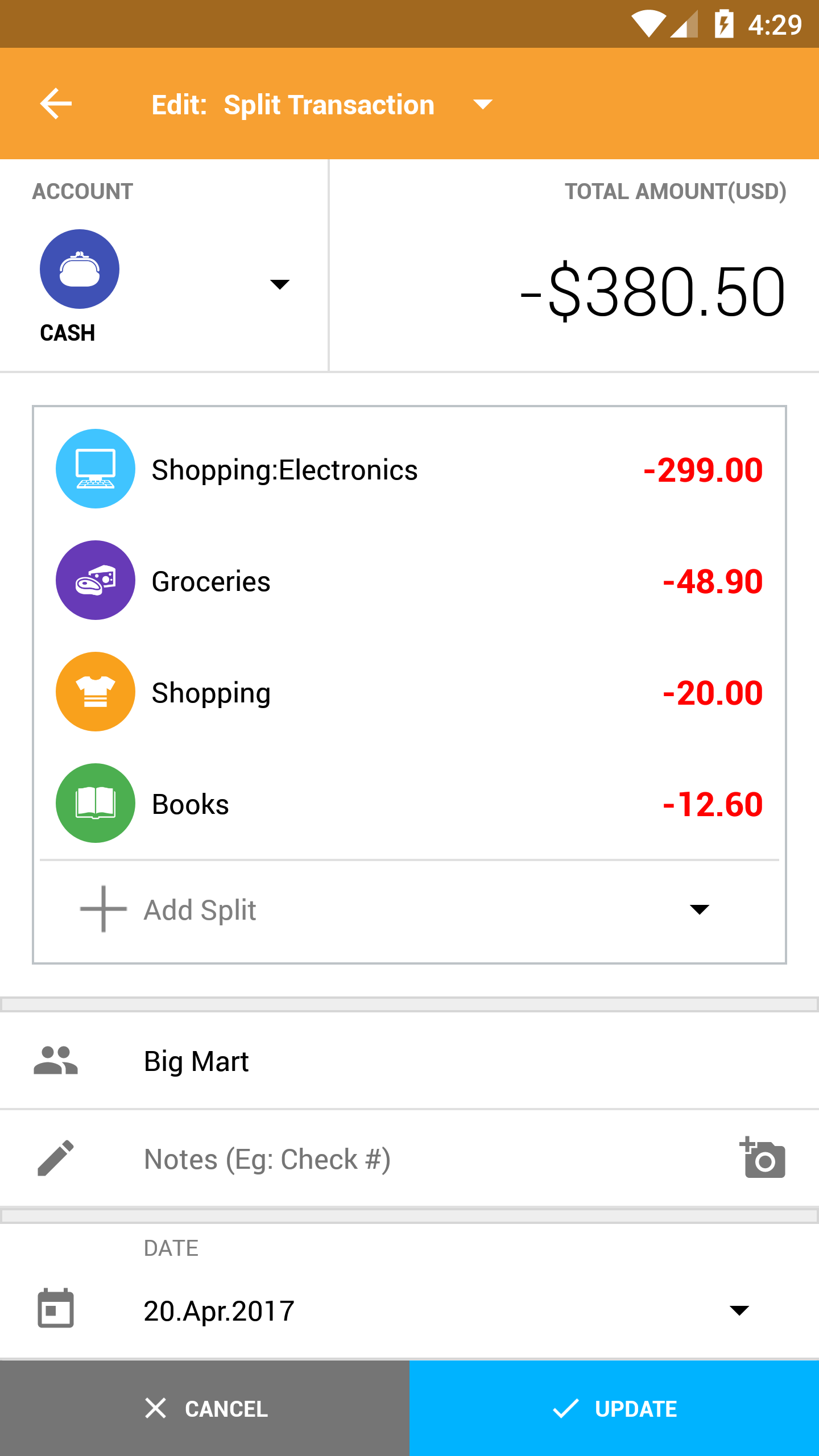
Transfers and Split Transactions:
The Transfers screen is also now more consistent with the other screens, easier to understand at a glance and makes better use of screen space than before.
For Split transactions, there is a new number pad optimized just for Split Transactions to switch categories quickly.


Above: Add Transfer, Add Split Transaction with the new custom number pad
Get the new design with the update now on Google Play!
As always, if you have any feedback, feel free to let us know!

Related